- Thank you received: 0
T or E
19 years 9 months ago #16174
by Unworthy1
Replied by Unworthy1 on topic Reply from Chris Gallant
"In the key below, arrows point to the faces spotted. Granted you may need a good monitor and good eyes to see them all--and perhaps a good imagination."
Whoa! A good imagination is no problem for you fellas! First you look at your kid and think that they are the result of some sort of cosmic accident, then you look at pictures like these and suggest that little green men might be responsible.
Enter twilight zone music here...
Romans 1:25 "They exchanged the truth of God for a lie..."
Please Log in or Create an account to join the conversation.
19 years 9 months ago #9026
by rderosa
Replied by rderosa on topic Reply from Richard DeRosa
Please Log in or Create an account to join the conversation.
- neilderosa
-
- Offline
- Platinum Member
-

Less
More
- Thank you received: 0
19 years 7 months ago #9237
by neilderosa
Replied by neilderosa on topic Reply from Neil DeRosa
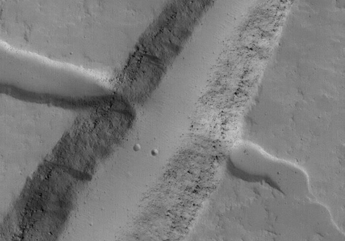
Around six months ago, I requested better imaging of the T or E feature to see if it would confirm any of our predictions. Recently the area was imaged again.
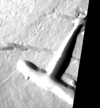
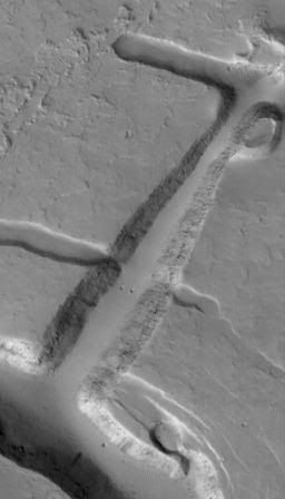
Here is the original SP243004, "T."
I predicted that the bright glare was the result of the sloped surface being hit by the glare of the early morning sun. I also predicted that two other arms (which could barely be seen in the context images) would be evident under higher resolution, and would branch off of the "curved backbone" at around 90 degree angles. I was right on both counts.
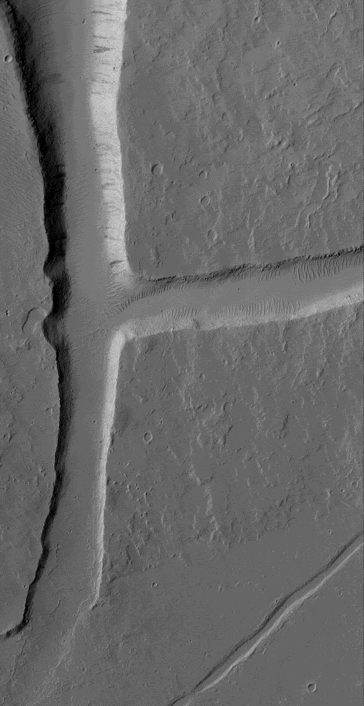
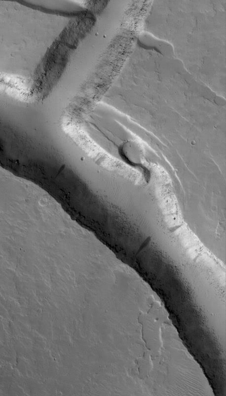
Here is S20001769, "the rest of the E."
We found what we expected but not all of it. The two lower arms do not look as "artificial" as the original "T" arm, and in normal lighting and higher resolution, (3 m/p, to the original 7.29 for the SP24 T), the glare is gone. But the shape of an E with a curved backbone is there just as predicted.
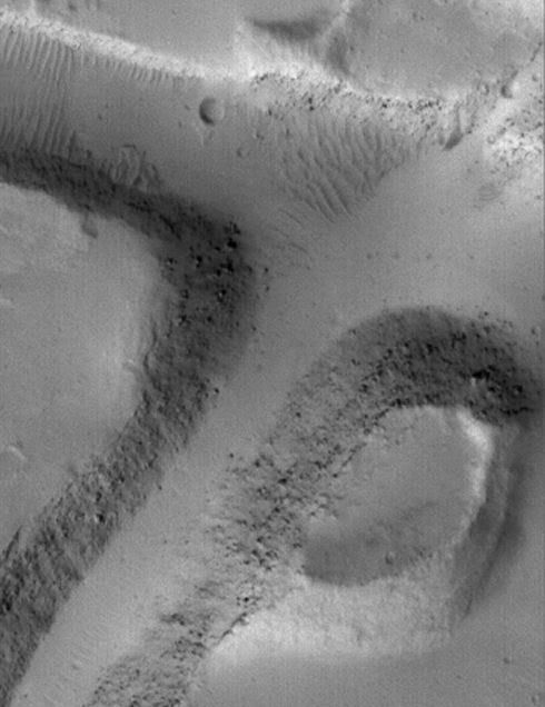
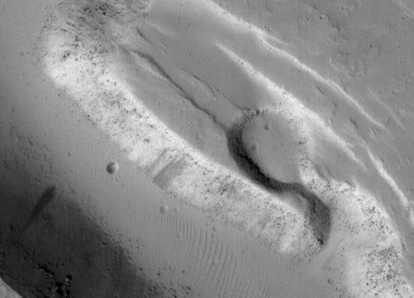
Here are closeups of the middle and lower sections of the E.
Middle,
and lower,
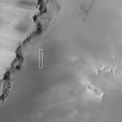
and here's the context image (S2001770) for the new hi-res image.
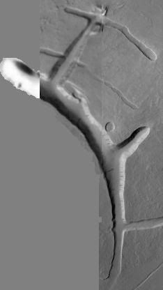
and here is a composite of the original T with the new lower section of the T or E.
Neil
Please Log in or Create an account to join the conversation.
19 years 7 months ago #9238
by rderosa
Replied by rderosa on topic Reply from Richard DeRosa
<blockquote id="quote"><font size="2" face="Verdana, Arial, Helvetica" id="quote">quote:<hr height="1" noshade id="quote"><i>Originally posted by neilderosa</i>
<br /> The two lower arms do not look as "artificial" as the original "T" arm, and in normal lighting and higher resolution, (3 m/p, to the original 7.29 for the SP24 T), the glare is gone. But the shape of an E with a curved backbone is there just as predicted.<hr height="1" noshade id="quote"></blockquote id="quote"></font id="quote">I don't know, I've seen tons of this stuff. Looks pretty natural to me. The one thing that would have really helped would have been some sculpted end to the middle extension of the E, like we were hoping for, which is obviously not there.
No, if we saw this first, before the unnatural looking part, I doubt if we would have gone any farther with it. In my humble opinion, the T just got "Skullfaced". But, you did a good job on the composite. Made it easy to see in perspective.
rd
Please Log in or Create an account to join the conversation.
- neilderosa
-
- Offline
- Platinum Member
-

Less
More
- Thank you received: 0
19 years 7 months ago #9241
by neilderosa
Replied by neilderosa on topic Reply from Neil DeRosa
<blockquote id="quote"><font size="2" face="Verdana, Arial, Helvetica" id="quote">quote:<hr height="1" noshade id="quote">We found what we expected but not all of it. The two lower arms do not look as "artificial" as the original "T" arm, and in normal lighting and higher resolution, (3 m/p, to the original 7.29 for the SP24 T), the glare is gone. But the shape of an E with a curved backbone is there just as predicted.<hr height="1" noshade id="quote"></blockquote id="quote"></font id="quote">
An analogy to “scullface” is fitting, for two reasons: one is that the detail of the newly revealed features is less than was hoped for. The other is that the new image does not address some of the most important issues. In the case of the T, the “T-Upright" was always considered the most artificial appearing part of the whole “E” formation. I refer anyone interested to our MRB paper on the subject, and certain earlier posts in this thread. Therefore, we need better imaging of the T-Upright itself, in order to improve our understanding of it. Of special interest are the unusually straight "machine-cut" edges and slopes of the T-Upright, the “diamond-shaped “head,” (or base), the way a smaller gully is “cut-across” by the larger T trench, the flat appearing bottom, and the sharp inside corners. Some or all of these predictions may not be confirmed upon higher resolution imaging, but drawing those conclusions prior to getting higher resolution imaging is premature.
Neil
Please Log in or Create an account to join the conversation.
- neilderosa
-
- Offline
- Platinum Member
-

Less
More
- Thank you received: 0
19 years 7 months ago #9246
by neilderosa
Replied by neilderosa on topic Reply from Neil DeRosa
Here's my amateurish composite of the T or E taken from Public Request images posted recently, and a small part of the original SP24 "T." There are some things to say about it but I'll save it for another time.
Sources:
www.msss.com/mars_images/moc/publicresul...06/07/S20-01769p.gif
www.msss.com/mars_images/moc/publicresul...06/01/S14-01916p.gif
1- "E" composite.
Here are some compressed close-ups of the T-Upright and other parts of the latest image, S1401916.
2- S14 cropped.
3- close-up of whole T-Upright.
4- close-up of inside angles and wide part of T-Upright.
5- close-up of narrow part of T and "base."
6- close-up of base.
7- close up of T-Cross and "round inlet."
8- close-up of round inlet and inside angle.
9- close-up of small gully bisected by T.
I'll comment later.
Neil
Please Log in or Create an account to join the conversation.
Time to create page: 1.920 seconds


